What Colour is Your Website?
Are you a serious voice over actor who is now prepared to launch your own website or expand your online presence? You may want to read on first before pressing that launch or submit button.
When searching the internet, any consumers or clients (or in this case, voice seeker) would seek an established individual or company not by sifting through the online yellow or white pages, but more likely click on a website that can immediately offer what they need. But do you know that more than the Google ranking, online seekers are attracted to the colour scheme of a website? And more likely their purchasing decisions are influenced by the feelings triggered by colours.
So you can’t just use black because it looks cool, or pink because it is your favourite colour. Using the correct colour palette is as important as the layout of your website as this can effectively communicate your personality and your brand.
Here are a few things about the Science of Colour in marketing that you can use when deciding on your colour scheme.
Know your Audience
Knowing the age, gender and nationality of your audience can play a big part in designing your website’s colour palette.
Colour can elicit different reactions from people of different ages. A younger audience is more attracted to vivid and brighter colours. Mature audience on the other hand is drawn to colours that are relaxing to the eyes, or hues that are more sober and restrained.
Women can perceive more colours than men, and as your audience is not gender specific, you may want to reconsider using colours like peach, teal (or anything in between) as they will be easily dismissed by men as mere notions. Use colours like blue, green or red that may appeal to both men and women.
Whether you are targeting a specific country or going global, you may need to do extra research on how colours are perceived in different countries. For example, white is a symbol of purity for western countries however it means unhappiness to some Asian countries like China, Japan and India. Pink is an attractive colour for the Japanese culture, but can be perceived as “not manly” for some European countries and India.
It may take a bit of homework, but you can be creative in choosing the colour scheme that is generally accepted in both genders and across regions.
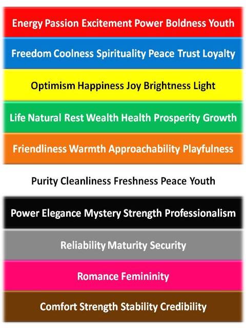
Common Colour Meaning
Black may be ideal for marketing and purple may exude creativity, but you may want to learn more about the common meaning of colours to create a combination that best suits you.

More Tips
Use Natural Colours
Avoid using very bright shades as it is fatiguing to the eyes and may turn off your prospective visitors. Combine more natural colours in order to get the emotional response you want from your clients.
Be Consistent
Use an average of 3 colours consistently across your pages. You may use up to four or five colours, but more than that may create inconsistency and discourage your clients from reading on the important parts of your website.
Use Contrasting Colours
Contrasting text colour and background also needs to be considered to make your content readable.
Here are also some tools or websites that can help you create the perfect colour scheme to match what you need.
COLOURlovers is a creative community where people from around the world create and share colours, palettes and patterns, discuss the latest trends and explore colourful articles.
Adobe Color CC is a helpful site that provides you with preset colours. You can choose colours based on the rating and comments of those who have used it.
ColorJack is also an online community that shares colour inspirations from all over the world. It also provides you helpful information on colour communication and colour formula.
DeGraeve Color Paletter Generator is best for coming up with your website colour scheme by giving you the colour codes from a stock photo that matches your design intentions.
As a voice over artist you may want to communicate to your target client that you are creative, trustworthy and passionate with your work. And show your peers that you are a savant in marketing and successful in your field. So that is purple, blue and red with a sprinkle of black and green – mix it all up and you may come up with a winning colour scheme.
Do you already have your own website or are you a member of one? Do the colours match your personality and brand?

